You're trying to get more of the right people to book a conversation from your website. A site can look polished and still hide the next step.
Give your advisor website four clear pieces on the first screen: a headline saying who you help, a short explanation of the conversation you offer, one action button, and an approved trust note below it. If the goal is a first call, let people pick a time on the page.
The rest of this guide walks through page structure, common page types, mobile and form choices, a made-up rebuild so you can see the contrast, what to measure, and what to send to compliance. Nothing here promises that a redesign, ads, or search work will produce clients.
Key takeaways
- Give each page one primary next step. Extra buttons that go to different jobs make it harder to choose.
- Write a headline that names who you help and what they came for. Generic lines about comprehensive wealth management don't help someone decide.
- Show credentials, a plain description of what happens next, and any client proof your compliance reviewer has approved.
- Test the page on a real phone. If buttons are hard to tap or the calendar is tiny, people leave.
- Count booked calls and attended meetings separately from form fills.
- Send testimonials, ratings, and any result claims to your compliance reviewer before they go live. This is marketing guidance, not legal advice.
What this kind of website needs to do
The visitor has a simple job: decide whether it's worth talking to you.
Your site's job is to help the right person say yes to that conversation, and to let the wrong person leave without a maze of links. That is different from a brochure that explains the firm and hopes they email you.
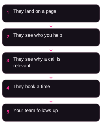
Keep the path short:
- They arrive from a search, an ad, a referral, or an email.
- They understand who you work with and what you help those people do.
- They see enough proof to feel the call is a reasonable next step.
- They book a time, or they take a smaller step you can follow up on.
- Someone on your team actually follows up.
A visit, a form fill, a booked slot, and a meeting that happens are four different things. Track them separately. The sequence above is a process, not a conversion rate.
If ads are sending people who already want a conversation, send them to a focused booking page. See Facebook ads for financial advisors and Google ads for financial advisors for how those visits usually arrive. For how a website sits next to other channels, see lead generation for financial advisors.
Why visitors leave without booking
Use these as checks. They are not findings from a study.
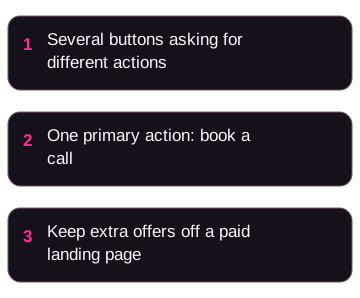
Too many next steps. The page offers Learn more, Contact us, Schedule a call, Download a guide, and Join the newsletter. The person has to guess which one you actually want.
A headline that could sit on any firm's site. If you could swap your name for a competitor's and the line still works, it isn't helping anyone choose.
No answer to "why you." A headshot and a credential abbreviation are a start. People also want a plain description of what working together looks like, plus proof your reviewer has approved.
Awkward on a phone. Small calendars, pop-ups that cover the screen, and forms that require sideways scrolling all stop the booking.
A contact form as the only door. If someone is ready to talk, asking them to wait for an email reply adds a delay you don't control.
Visual polish doesn't fix a page that asks five different things.
Build the page in a clear order
You need a clear first screen, some proof, one path, and a booking tool that works.
First screen: who you help, and one button
Everything visible before a scroll should help the right person lean in. The wrong person should be able to tell this isn't for them.
Include:
- Headline: who you serve and what they came for. Example headline, not a result: "We help dentists in their 40s plan around a practice sale."
- Subhead: one sentence on how you work with those people.
- One button: a specific action, such as "Book a 30-minute intro call." Learn more and Contact us don't say what happens next.
- One trust note under the button: a credential, years in practice, or a publication name your reviewer is comfortable showing. Don't invent figures.
Skip rotating image carousels, stock handshake photos, and taglines that could belong to any firm.
Proof a first-time visitor can actually use
Put proof where it can be seen, not only on an About page.
Useful pieces, each subject to your reviewer's rules:
- Credentials, and any public registration link your reviewer wants on the site.
- Client comments, ratings, or logos only after compliance review.
- A short "what happens after you book" section so the call feels predictable.
- Your process in three steps, instead of a long mission statement.
- An anonymized client situation, with numbers only if your reviewer approved them.
If you don't have approved client proof yet, don't fake it. Use a clear process, credentials, and a direct booking path while that review is in progress.
One conversion path
Pick one primary goal for the page, such as booking a discovery call.
Secondary offers, such as a newsletter or a guide, should support that same path or live on a different page. A homepage can mention a guide. A paid landing page usually shouldn't compete with the calendar.
Make booking easy
Embed the calendar on the page when you can. Sending people to a "we'll reply in 24 hours" form adds wait time.
For a first visit, ask for name, email, phone, and one useful question. Extra fields are extra work. Don't treat any field-count percentage as a rule. Watch your own form. If people start and don't finish, cut or reorder a field and try again.
A practical qualifying question: "What's the main thing you want help with right now?"
If you need more detail, a short multi-step form (one question per screen) can feel lighter than a long wall of fields. That's a usability choice, not a proven lift.
Check how fast the page feels on a phone. Use PageSpeed Insights as a lab check, then confirm on a real device. I can't honestly tell you a score that guarantees bookings.
Five page formats you can choose from
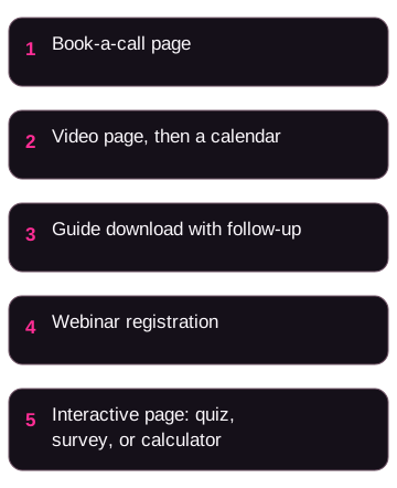
You don't need every format. Match the page to how the person got there and what you're willing to follow up on.
1. Book-a-call page
A single page: headline, two or three bullets on what the call covers, a bit of approved proof, and an embedded calendar. On paid landing pages, consider dropping the full site nav so the only job is booking.
This is usually the right page when ads are sending people who already want a conversation.
2. Video page
A video that explains the problem you work on, how you work, and what the call is for, then a booking form under it. Use enough time to explain those points, then cut repetition. Choose video when seeing and hearing the advisor helps explain the offer.
3. Guide or checklist download
A useful file or page in exchange for an email. This fits lower-intent visits, and only if someone on your team (or a sequence you actually send) follows up. Pair the download with a later offer to book.
See email marketing for financial advisors so the download isn't a dead end.
4. Webinar registration
A page for a live or recorded session on a specific problem, such as retirement income for business owners. After the session, the next step is a call. This only helps if the session is worth attending and you have a plan for no-shows.
5. Interactive page
A quiz, a referral survey, and a calculator ask the visitor to do different things. Pick the one whose answers your team will use.
#### Quiz or assessment
A short set of questions that gives the person a plain-language result and asks for an email for the full write-up. Quizzes can feel more useful than a blank form. Judge them by whether you use the answers in follow-up, not by a multiplier from another article.
#### Referral or survey
For people sent by a client or another professional. A short survey captures context before the call so you're not starting from zero. Keep it short enough that a referred person still finishes it.
#### Calculator
A retirement, tax, or compound-growth calculator on the page. The person enters their own numbers, sees a result, and can book a call to talk about it. Label the output as a tool, not advice. Your reviewer should see the copy around it.
Ask which of these you can staff. A quiz nobody scores, or a calendar nobody watches, wastes the click.
Make the layout easy to use
Put the main point first. Keep important lines at the start of a section. Place the same primary button after the headline, after the proof, and at the end of the page.
Use the same button wording throughout. Switching between Book a call, Schedule now, and Get started makes people re-read.
Mobile
Design the phone version first, then adjust for a large screen.
Watch for:
- Pop-ups that cover the whole screen
- Phone fields that don't open the number keypad
- Calendars too small to tap
- Forms that scroll sideways
- Pages that sit spinning on a cellular connection
Test on iOS and Android before you spend on ads. PageSpeed Insights is a useful lab check. It is not a substitute for tapping through the booking flow yourself.
Forms
For a cold visit, four fields is a reasonable starting point. For someone who already knows you, you can ask a little more. If you need qualification beyond name, email, and phone, add one question rather than a full fact-find.
If abandonment is high, look at the phone field and any question about how much they have to invest. If people start the form but do not finish, inspect those fields and test one change at a time. Remove or delay the field and see whether more people finish. That's a test on your page, not a universal law.
A made-up rebuild, so you can see the contrast
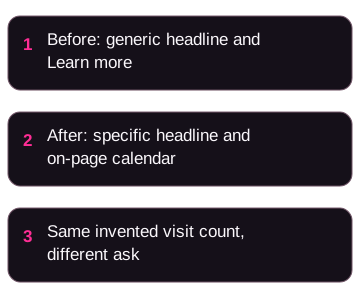
The firm name Greenfield Wealth Advisors is invented. The Before column is a composite of brochure-style choices. The After column is one booking-focused alternative. These are not results from a client.
| Piece | Before (example) | After (example) |
|---|---|---|
| First-screen headline | Comprehensive financial planning for every stage of life | We help surgeons plan retirement income during peak earning years |
| First-screen button | Learn more (goes to About) | Book your 30-minute income-planning call (calendar on the page) |
| Navigation | Eight items, including Careers and Privacy in the main bar | Four items: Services, About, Planning, Schedule |
| Proof | Three headshots and generic bios | Process in three steps, plus any testimonials your reviewer has approved |
| Trust on the first screen | None | Credential and a publication name, if approved |
| Phone experience | Desktop layout squeezed down, pop-up covers most of the screen | Large tap targets, click-to-call, calendar that fits the screen |
| Form | Nine fields, no inline error messages, generic thank-you page | Name, email, phone, plus one question |
| Primary next step | Email us | Pick a time |
Same visits. Different ask. Whether bookings go up depends on traffic quality, follow-up, and the offer, not on the table above.
Here's the math with made-up numbers
Suppose 1,000 people visit in a month. That number is invented.
If 8 of them book a call, that's 8 / 1,000 = 0.8%.
If 42 of them book a call, that's 42 / 1,000 = 4.2%.
That's 34 more booked calls from the same 1,000 visits (42 minus 8), and 42 divided by 8 equals 5.25 times as many bookings. This is example arithmetic, not a case study, and it says nothing about how many of those calls become clients.
If those 1,000 visits cost $4,000 in ads (also invented):
- $4,000 divided by 8 booked calls equals $500 per booked call
- $4,000 divided by 42 booked calls is about $95 per booked call
A booked call is still not a client. If one of those 42 people becomes a client, you spent $4,000 on that month's visits plus your team's follow-up time. If none become clients, you spent the money without new fee revenue. Don't treat AUM as revenue, and don't treat a booking as a paid client.
Measure booked calls, not just visits
Set measurement up before you keep tweaking headlines. Otherwise you won't know what changed.
GA4
In Google Analytics 4, track at least:
- Form submits
- Calendar bookings (this usually needs a custom event from your scheduling tool)
- Scroll depth, if you care whether people reach the proof section
- Video completes, if you use a video page
- Clicks on the primary button, with a label you can read later
Build a report that splits form fills from bookings by traffic source. Use your own data. Don't assume one source will dominate.
Heatmaps and session recordings
Tools such as Hotjar or Microsoft Clarity can show where people stop, skip, or tap with no effect. Ask each vendor what the current plan includes. Feature lists change.
Look for:
- Where scrolling stops
- Sections people skip
- Taps on things that aren't links
Form abandonment
If your tool shows drop-off by field, start there. Then change one thing at a time.
Tests
If you use an A/B testing tool, such as VWO, test a headline before you rebuild the whole site. Agree in advance how long you'll run it and what you'll count. A few days and a handful of visits isn't enough to decide. I can't give you a visitor minimum that makes a test valid for every firm.
Get a compliance review before you publish proof
If your website includes testimonials, logos, ratings, or performance figures, have your reviewer check them. Those are marketing choices with regulatory risk. This article is not legal, compliance, or investment advice, and it does not say your site is compliant.
Before you publish:
- Have your compliance reviewer approve every client comment, video, rating badge, and result claim, including on-screen text and captions.
- Ask them what public registration links, Form ADV links, and policy pages your firm needs.
- If you are a broker-dealer or dual-registered, ask which communications rules apply to the page. Don't assume RIA website habits cover that.
- Don't treat phrases like "secure your retirement" as harmless filler. If it sounds like a promise, your reviewer should see it.
Your reviewer can start from primary material such as the SEC Marketing Rule adopting release and FINRA Rule 2210. Those links are not a substitute for their sign-off.
Build that review into how you edit the site, so a new testimonial can't slip onto a live page overnight.
WordPress, Webflow, and Duda
The platform is a means. What matters is whether the live page is fast enough to use, easy for your team to update, and able to hold an embedded calendar and tracking.
WordPress: ask the builder who handles hosting, updates, and plugin maintenance. Ask who fixes a break and what that support costs.
Webflow is a visual builder with its own hosting and design system. Some teams like it when they want a custom layout without a full engineering staff. Ask about CMS limits, blog workflow, and who can make changes after launch.
Duda: if you want one vendor to run several advisor sites, ask them to demonstrate how that work is managed. Ask about editing rights, testing features, and what you can export if you leave.
I haven't run a ranking or conversion test of these three against each other, so I won't tell you one wins. A slow page on any of them will feel worse than a fast page on another. Ask for a current demo on a phone.
For how the site supports search, see SEO for financial advisors.
Page outlines you can adapt
These are starting outlines, not required templates.
Discovery call page
- H1: who you help and what the call is for
- Subhead: how you work, and how long the call is
- Trust line: credential and other approved facts
- Three bullets: what you'll cover
- Embedded calendar
- One approved testimonial, if you have one
- Three short questions people ask before they book
Guide download page
- H1: the resource and what they'll be able to do with it
- Subhead: who it's for
- Three bullets: what's inside
- Form: name and email, unless you have a reason to ask more
- A cover image of the actual file
- What happens after they submit, in one short paragraph
Don't promise an emailed sequence you don't send.
Homepage
- First screen: niche headline, subhead, one CTA
- Credentials and other approved signals
- Three problems your target client actually has
- Your process in three steps
- Proof your reviewer has approved
- A short bio that states your role without invented stories
- FAQ
- Repeat the same CTA
Check these items before you launch
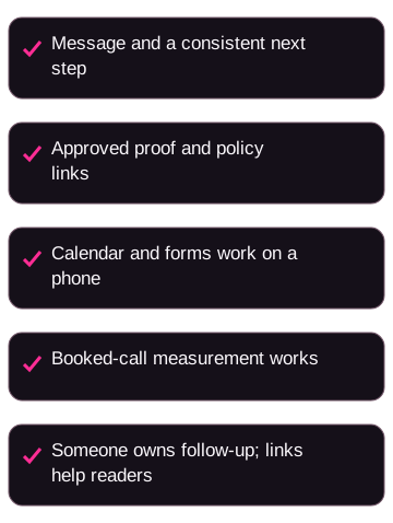
Check these five parts of the page and name an owner for each.
- The message and next step. The headline names a real group and a real job they need help with. Use one primary button on the first screen, after proof, and at the bottom. Keep its wording consistent. Explain what happens after someone books.
- Proof and review. Make credentials or another approved trust detail easy to find. Have your reviewer approve the claims, proof, and required policy links before publication.
- Booking on a phone. Test the calendar, including time zones. Keep the form short, put errors next to the fields, and check that pop-ups do not block the button.
- Measurement. Test that booked-call tracking fires in GA4. If you use a heatmap or recording tool, check that it runs on the intended pages.
- Follow-up and useful links. Name who contacts a new booking and when. Link related articles where they answer the reader's next question. For example, SEO for financial advisors in a section about search.
If an item is vague, fix it before you buy more traffic. An unclear page still needs fixing when the ad budget grows.
Want a second set of eyes on the site you already have?
OJay Media designs advisor websites and the ads, qualification questions, and follow-up around them, under your firm's name. We have a commercial interest in this work. The checks above still apply if you use another builder.
If you want to see how we'd approach your pages, see the process and apply to work with OJay, or schedule a Growth Advisory Call when you're ready to talk. Bring your current homepage and one landing page. We'll look at whether the next step is obvious.
Building this still takes time, money, testing, and follow-up. A new theme is not a client pipeline.
A few common questions
How long until a website change shows up in bookings?
It depends on how many of the right people visit, and whether someone answers the calendar. If traffic is thin, pair the page work with SEO for financial advisors or paid campaigns, then review booked calls on a date you set in advance. A quiet week after launch doesn't tell you much.
Is there a conversion rate I should copy?
Use your own baseline: booked calls divided by visits, using the same definitions before and after a change. Then track how many of those calls happen, and how many become clients.
Can I use client testimonials on an RIA website?
Ask your compliance reviewer. Rules differ by registration and by how the comment was obtained. Don't publish a video, a rating badge, or a result claim until they approve the wording and any disclosure that sits with it. This is not legal advice.
What's the most useful first change?
If the goal is a conversation, put a working calendar on the page and retire the contact form as the main door. Then make sure a person on your team is free to take those meetings. A calendar nobody watches is just a prettier dead end.